Editing the Waifu's Domain
BUT WHY?
Honestly while it was fine initially, I decided to overall how the blog looked to make it stand out more. I began by deciding to change the theme, the theme I had been using for the longest time was just the original theme but only slightly adjusted to display as a green color instead. I decided to pick a new theme to start things by choosing a Contempo theme, I chose it due its more dynamic looking appearance. Once that was done, I decided to give a little spin to the default design. I decided to add an image on the top to help make the blog feel more personalized and to give people an easy identity for the blog that will help people associate the image with this blog and refer back to it. After this, I chose to change the theme to be a different colour, originally it was a black colour, but I decided to make it more navy as I thought it would blend well with the main theme I chose (that being a baby blue colour). The font I decided could also do with a makeover and I chose a really nice looking font that pops in the right ways called "Luckiest Guy". I applied it to as many things as I could to help give the site a better idea of consistency.
 - A small preview of the new site.
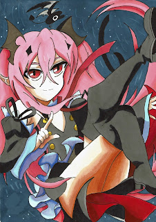

This comment has been removed by the author.
ReplyDeleteTi-Da-ti-da-ti-da-da-da
ReplyDeleteoh Hi Fionn,
I really like the new look of your blog ! I remember what your blog used to look like and it was 555 but this new look is 666!
There's a lot more clarity and purity with it.
As I close my eyes, I feel it all slipping away, the memories of your old blog's look;
like dead memories in my heart!
Look Not All Hope Is Gone in Humanity after looking at this blog!
Put your hands away, I'm gone, Goodbye, it's so depressing.
(Yes, these are all reference to slipknot, Enjoyed.)
Y.I.S
Sarah H